
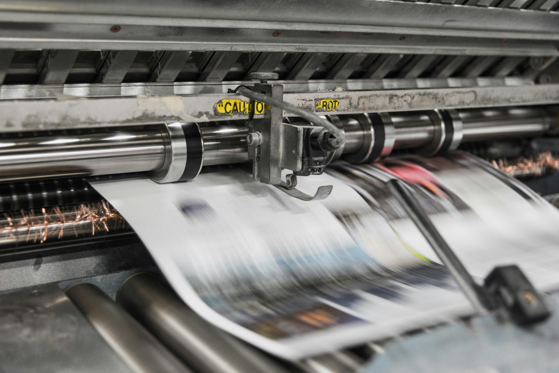
Introduction: Excellent Design on Screen, a Disaster on Paper
You’ve carefully designed your project on the computer—choosing colors, arranging the layout, and selecting the best fonts. But when the printout comes out, the colors are off, the images are pixelated, and the text is cut off. Frustrating, isn’t it?
The problem lies in the fact that computer screens and printers are two different worlds. Monitors display colors using light (RGB: Red, Green, Blue), while printers use ink on paper (CMYK: Cyan, Magenta, Yellow, Black). This difference is often the root cause of printing errors.
Here’s the good news: almost all design mistakes can be avoided if you know the basic rules. These are the 10 most common errors that often ruin print results—and how to fix them before your files are sent to the printer.
1. Ignoring Color Modes: CMYK vs RGB
Problem: Designs are created in RGB mode (the standard for screens), but printers use CMYK. Bright colors on the screen (such as neon orange or electric blue) will appear dull or grayish when printed.
Solution:
- Always create documents in CMYK mode from the start (in Photoshop/Illustrator, select Color Mode: CMYK).
- If you’re using Canva, download the file using the “Print PDF” settings or enable the CMYK option.
- If the design is already in RGB, convert it to CMYK and double-check the colors.
2. Not Adding Bleed (Cutting Tolerance Area)
Problem: During the cutting process, the machine has a cutting tolerance of 1–3 mm. If the background or image ends exactly at the edge of the final size, a white line will appear along the edge.
Solution:
- Include a 3 mm bleed on each side of the design.
- Example: on a 9×5 cm name card, make the file 9.6 cm × 5.6 cm with a background that extends to the end of the file.
- In Canva, turn on “Show Print Bleed” and make sure the background extends to the gray outline
3. Image Resolution Too Low (Under 300 DPI)
Problem: Pictures taken from the internet (typically 72 DPI) will appear grainy, blurry, or pixelated when printed in large format.
Solution:
- Use a picture with a minimal resolution of 300 DPI for the final print.
- Formula: (Final width in cm × 118) × (Final height in cm × 118)
- Example for A4 size (21 cm × 29.7 cm):
- Width: 21 × 118 = 2,478 pixels (rounded to 2,480 pixels)
- Height: 29.7 × 118 = 3.505 pixels (rounded to 3,508 pixels)
- So you need an image that is approximately 2,480 × 3,508 pixels.
- Avoid using images from Google Images for large-format printing. Use paid stock photos or your own photos taken with a professional camera.
4. Text Is Too Light or Too Small
Problem: Fonts with a hairline weight (0.25 pt) or text sizes smaller than 6 pt will appear broken or even disappear entirely when printed.
Solution:
- For body text, use a minimum of 8 pt.
- For important elements, ensure that make sure the font weight is at least 0.5 pt, or use the Bold style.
- Avoid using colors that are too bright on a white background—the contrast will be very low.
5. Ignoring the “Safe Zone”
Problem: Text or logos that are too close to the cutting edge (1–2 mm) risk being cut off during the finishing process.
Solution:
- Leave a minimum margin of 5 mm from the cutting edge for all important elements.
- Imagine an invisible frame within the design. All key content must be within this frame.
6. Not Embedding or Outlining Fonts
Problem: The font you’re using may not be installed on the computers used for printing. As a result, the system replaces your font with Arial or Times New Roman—and the layout gets messed up!
Solution:
- Always “outline” all text in Adobe Illustrator/InDesign (text is converted to vector graphics).
- If you’re sending a PDF, check the “Embed Fonts” or “Subset Fonts” option when exporting.
- In Canva, download in Print PDF format—fonts are automatically embedded.
7. Using the “Wrong” Black Color
Problem: Using C=0, M=0, Y=0, K=100 produces dark gray, not jet black—especially for large areas.
Solution:
- For large areas, use Rich Black: for example, C=60, M=40, Y=40, K=100 for jet black.
- For small text (under 12 pt), simply use K=100 (avoid Rich Black to prevent the text from appearing blurry).
- Consult your printing team about your preferred Rich Black formula.
8. Forgetting to Account for Folds (Brochures & Folders)
Problem: Text placed directly in the fold area will be cut off or bent, or even disappear into the fold.
Solution:
- For tri-fold brochures, leave a minimum margin of 5–7 mm on both sides of the fold line as a bleed area.
- Request a mock-up or sample brochure from the printer before mass production.
9. Finishing Effects Overload (Spot UV, Embossing, Foil, Lamination)
Problem: Too many finishing effects in a single design increase the risk of misregistration (misalignment) and make the design look over-the-top.
Solution:
- Choose up to 2 finishing effects per project. For example: Spot UV + Embossing, or Gold Foil + Matte Lamination.
- Consult with the Blackwood Ideas team to find the best combination for your product.
Failure to Proof or Print a Sample Before Mass Production
Problem: What looks perfect on your monitor isn’t necessarily perfect on paper. There are many variables: monitor calibration, paper type, machine temperature, and even the humidity in the production room.
Solution:
- Always request a proof or sample print (1–3 sheets) before mass production.
- Check the proof under natural light (during the day), not under indoor lighting.
- The cost of a proof is much cheaper than the cost of reprinting 1,000 defective pieces.
Conclusion: Good Design Is Print-Ready Design
Nearly 70% of the files submitted to the print shop contain at least one of the errors listed above. By understanding and applying these tips, you’ll save money and time and ensure that your creative ideas are brought to life perfectly.
Remember: “A design that looks good on screen isn’t necessarily good in print. A print-ready design is one that adheres to technical guidelines.”
Still unsure about your design files? The teams at Blackwood Ideas and Print Here are here to help you review your files, offer technical advice, and ensure that every one of your printing projects goes smoothly.